A manga upscaler online is most useful when a scan is readable but too small for its intended display. It can enlarge the image and propose detail, but it cannot recover the exact ink that disappeared in the source. Treat the result as a draft to inspect, especially around eyes, lettering and fine hatching.
Decide whether enlargement is the right repair
Open the source at its native size before uploading it. If the characters are already readable and only the display dimensions are insufficient, enlargement is a reasonable first test. If the scan has torn edges, missing strokes or a heavy gray cast, those are different problems: a larger version can make them more obvious.
Keep the original file and work on a copy. Avoid making several JPEG copies along the way; new compression can introduce halos around black strokes. For a self-created page, export directly from the drawing application when possible instead of enlarging a screenshot.
Run one controlled test
Open the Manga Upscaler, upload a page you own or have permission to process, and check the available settings before generating. Start with the smallest enlargement that meets your display need rather than assuming that the largest output is best.
If the tool offers a prompt, try: “Preserve thin black ink contours, speech-balloon borders and panel geometry. Improve readability without adding eyelashes, hatching or new texture.” This specifies what to protect; it does not guarantee exact preservation.
Download one result and compare it against the source. Do not repeatedly feed the enlarged output back into the tool. Each pass can reinforce an invented contour and make it harder to identify where the first change occurred.
Inspect four small regions
Look at an eye or hair strand for doubled outlines; a speech balloon for changed letters; a flat screentone patch for moiré; and the panel border for waviness. Compare both images at the same displayed size, then inspect the output at 100%. A result that looks impressive when zoomed out can still have unreadable text.
For example, a page intended to fit a 1,200-pixel reading area does not automatically benefit from a 4,000-pixel export. Choose dimensions for the destination and keep a smaller delivery copy if the full output adds unnecessary download weight.
When to reject the result
Reject an enlargement if it changes the words, turns dotted tones into blotches or adds plausible but unsupported facial detail. Try a cleaner source or a more restrained setting instead. If damage is the main issue, use the restoration tool on a separate copy and compare that repair before enlarging it.
Is a sharper page always more accurate?
No. Sharpness and fidelity are different. A clean edge can be an invented edge, and a darker letter can be the wrong letter. The useful result is the one that meets your display size while retaining the page's original reading order and recognizable drawing.
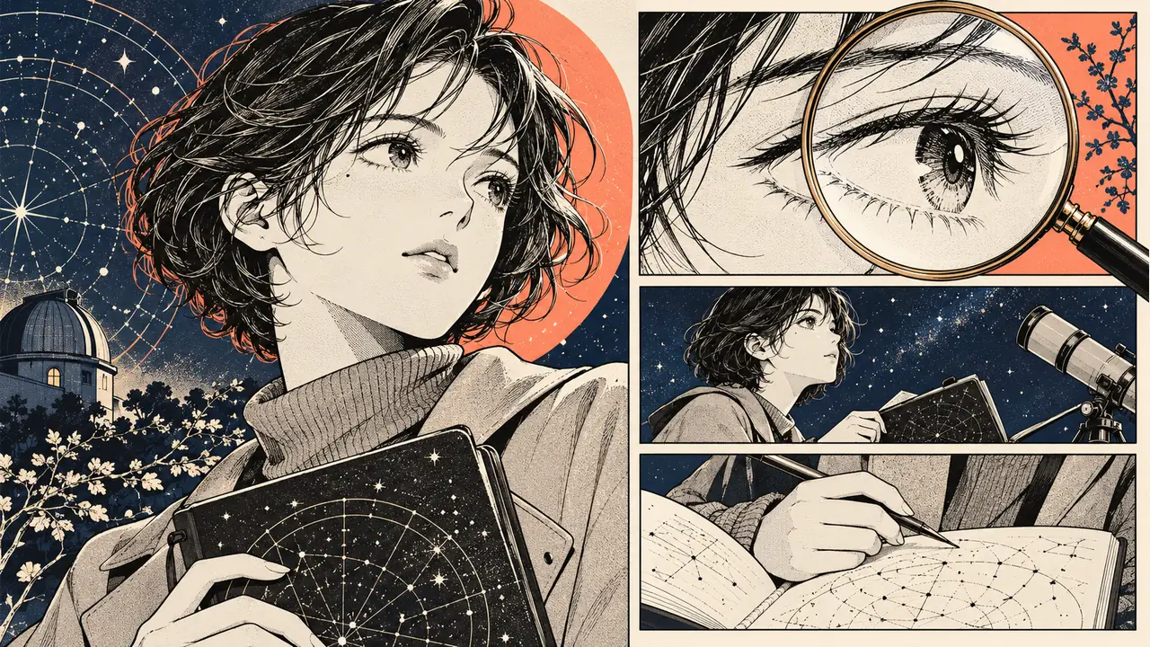
Cover: an original AI-generated editorial illustration, not a measured upscaling result.


